

 Email:


Tired of the commonplace brochures that you see on the streets? Annoyed of the way people throw away your company’s brochure into the waste bin without even a quick glance? Get this fact straight – unless the marketing tool is really trendy and catchy, it will fail to please the audience. If you are eager to make your brochure stand out, talk to a professional and efficient graphic design company. He/she will interpolate the most appealing and up-to-date elements into the brochure that will make it the best among equals.
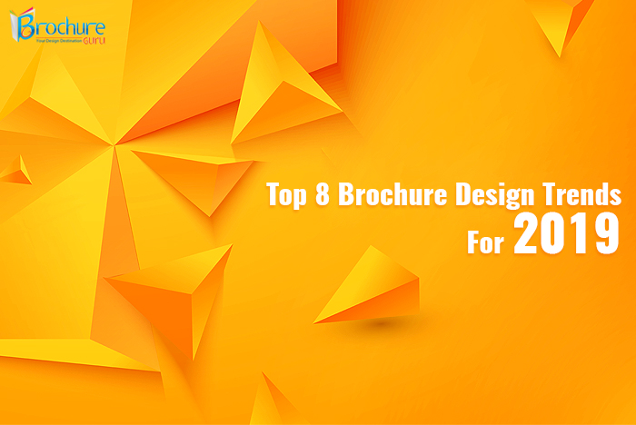
Make sure that 2019 does not pass as a not-so-important phase of your business. Check out how to publicize your venture and your offerings.
The entire exercise of creating a unique brochure revolves around the need to attract target audiences. As a design trend brings along new ways of using colours and elements, it does create an impact.
Utilize the palette of colours at your disposal
Till now, designers have resorted to dim and sober colours, thinking that such an approach would mark the sophistication of the brand. However, bold and bright is the ‘in thing’ and brochure designers can make use of patterns of colours and gradients.
As some brands may want to re-brand, the recreation of the same brochures might see the use of a wide range of hues. For example, instead of a solid monotone, saturated and vibrant colours may be used with muted colours and dusty pastels randomly.
Multifarious Typography
Attention-grabbing skills at using various types of typefaces are one of the most desired aspects this year. One may notice brands customizing their own typography and not sticking to a particular pattern. To stay ahead in the competition, opt for a tailor-made font for your marketing tool.
Unlike colours, where brightness may occupy quite an honorary position; bold will give way to a combination of typefaces. While the front cover may have a bold typeface, the inner folds may display different fonts for body text, sub-headings and headings. On the contrary, the front cover too can have mixed typefaces, just to reach out to the target audiences. The fonts may also be coloured or vector.
Illustrations are the talk of the year
If the illustration on your brochure is not attractive enough, your business stands no chance. It has to be attention-grabbing so that it can convey the brand’s message clearly. This year, designers may leverage the power of better interaction with the audience. So far, images have described services and products and that too with adequate information. But they do not make emotional contact with the audiences. With the advent of illustrations, people will get a pleasant surprise. So much so that they will feel compelled to take the next step. By adding animated retro designs to flat illustrations, the designer can add magic to your marketing call. Not just brochures, graphic designers can instil uniqueness even in flyers, pamphlets and posters. Why wait?

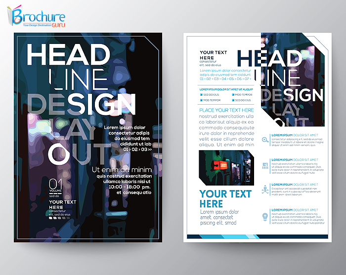
Say bye-bye to grids!
When every aspect of the brochure is changing, why will the grid system stay behind? In fact, new designers may try to experiment with the grid system or not use it altogether. Usually, people like to go through brochures when they are sure that they do not have to spend time to understand things. But times are changing, and the new generation of designers, as well as, audiences have more to offer, be it an e-brochure or a physical one.
Graphic designers, in their aim to make creative brochures, will try to get rid of the use of grids even when designing logos. This approach may offer them the freedom when they are getting ready to set a layout for the brochure’s cover page or inner pages. In the pursuit of creativity and uniqueness, designers may gift you completely strange-looking brochures that you had never imagined in your wildest dreams. For instance, the audience may not find the content where they are expecting it to be. Send them on a joyride to search for the content!
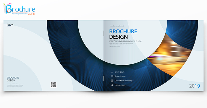
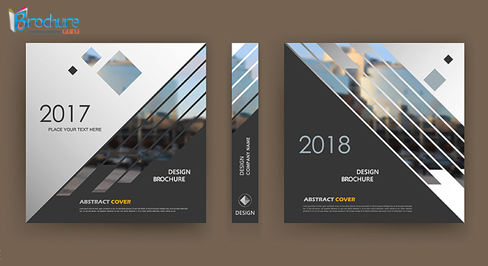
Shapes, shapes and more shapes!
The same old rectangular brochures of the years past have stopped interesting people. It is now time to attract the audiences with something weird and unknown. Why not try out various shapes like hexagon and pentagon? The professional might as well use circular and square shapes. Share your ideas with them.
Use 3-D at its best
3-D is anything but new. However, in spite of being tried and tested, it offers an unexpected experience to the human mind. Would you not end up being fascinated if you see something having depth? Thanks to immersive marketing, designers have begun to carry conventional promotional pieces into the future.
3D illustrations and colours will render the illusion of depth, online brochures will feature 3-D page-turning impacts, and travel, real estate, kids’ products, as well as, prize draws will witness pop-up brochures. It is to be seen if the world is ready for a revolution in brochure making art or not.
Lights can make a difference
Graphic designers will have a great enjoyment of possibilities in colour-gel photography. By using colourful lights, they can create unparalleled, interesting and engaging solutions in the photographs of the brochures. Varying colour fading, colour shades and contrasts will make the brochures worth it.
A minimalist approach works like magic
When a brand message is conveyed with minimum design, reaching out to the potential buyers of your products or services is easy and effective. Who would want to be overwhelmed by design, and then, get no insight into the company or its offerings? Therefore, most designers prefer the minimalist approach while creating brochures. The design can be unique, the fonts can be mixed, the colours can be bold, but the ultimate result should be easy to understand.
Given the fact that in the earlier part of the blog, we spoke about mixed colours and a combination of typefaces, the current comment can sound quite confusing. However, designers have to make sure that whether they keep it simple or complicated, the outcome has to be such that the person receiving it takes the next step after going through it.
The above-mentioned brochure design trends have the highest chances to rule 2019. But when you are looking ahead to disseminate a never seen before brochure, you need to approach a reliable brochure design platform. The company should be able to cover all aspects of graphic designing, including logo design, catalogue design, leaflet design and more. So without further ado, go ahead and give your brochures the best shot.
One Reply to “Most Sought After Brochure Design Trends of 2019”