

 Email:


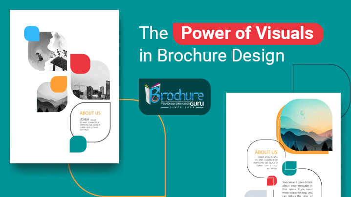
Brochures appear to be one of everyone’s works of art as there are so many different patterns and styles of them. Sure, you may have encountered a good number of flyers throughout your life. Do you know what, though, makes each of them feel different? An effective brochure design can seem very enticing and powerful. With the use of this item, you can instruct any audience because it is a strong instrument. Yet, you must focus on the essential components if you want to be successful and reach your audience. You may save time and significantly enhance performance by including visual information, such as brief movies and still photos, in your messages rather than just text. Integrating visuals in your brochure design is one such effective method to grab the attention of consumers. While e-brochures can have videos and infographics, flyers can be adorned with various images and hard-hitting graphics.
What you perceive is what you get – this is the main concept when it comes to branding. At least, that is how potential customers will feel. It is up to the brand to gain that type of trust; they do not have any reason to give a visually unappealing brand the benefit of the doubt. Brochures that contain visual components help you to influence perception and make an impact on your brand’s outward manifestations. Particularly since they go beyond text-based communication, images, and videos are potent forms of communication. They are more compelling because they communicate on a primitive, emotional level. Yet, you must ensure that your graphics are communicating as they should, or else the message can be misunderstood.
Table of Contents
- What is visual communication in brochures and why is it important?
- What challenges can you overcome by incorporating visual aspects in a brochure?
- What are the different elements of visual elements incorporated in a brochure?
- How to design an exemplary brochure with visual identity?
- Conclusion
What is visual communication in brochures and why is it important?
The act of employing visual components to convey a message, motivate behavior change, or arouse an emotion is known as visual communication. Graphic design and communication design make up the two components of visual communication in brochures. Communication design is the process of developing a message that informs, inspires, and engages the audience. Graphic design, on the other hand, makes use of design principles to make that message clear and appealing to the target audience. Choosing the pieces for your brochure that will give your audience the greatest significance is the essence of visual communication. Text, movies, symbols, shapes, images, and data visualizations are frequently used as these elements.
Brochures can be made impactful by employing the following techniques for visual communication:
* Demonstrating the value of your effort through data visualization
* Using lines and shapes to depict processes and flows
* Making information more unforgettable by using symbols and iconography
* Sharing stories through data and visuals
* Using color to draw attention and emphasize value
In the contemporary environment, we deal with people from all kinds of backgrounds and occupations who have various learning styles and perspectives. Given this reality, consumers represent a particularly intriguing demographic for whom communication must be done in a way to capture as much attention as possible. Using visual elements in brochures is a certain approach to achieve this. Visual communication must be included into both your electronic and printed brochures because it bridges the gap created by traditional word-focused forms of communication. In essence, images keep things interesting and new. As a result, you should always make plans to have brochures made with a variety of graphic components.
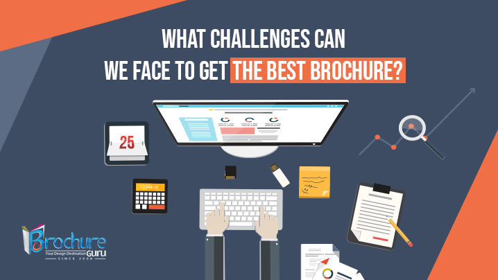
What challenges can you overcome by incorporating visual aspects in a brochure?
A typical problem is that you invest time and money into creating a fantastic brochure, but it falls short of having the desired effect on the audience. How can you prevent this and guarantee that the brochure’s content has the desired impact? Obviously, by utilizing visual components. If you are wondering what other challenges you could have with a brochure devoid of graphic components, consider the following:
-The first challenge is the limited attention of customers – The typical human attention span is 8 seconds. It goes without saying that the tendency of paying less attention is growing. It has been observed, nevertheless, that using visual communication assists brochure content to be as distraction-free as feasible. The usage of images aids in helping readers refocus and come back to the key points of your material. You may make a stunning brochure with infographics, bright photographs, and videos and elicit the appropriate response from your target audience.
-The second challenge is remembering the content – Customers are likely to discard your leaflet after giving it a cursory scan. Your brand’s name and mission will also slip their minds. People only seem to return to the types of work that have strong visual elements, which has been seen often. Making your brochure distinctive will thus need the use of many graphic components. While your audience reads the text, effective visual communication will improve reading comprehension and retention. If you offer the idea of your brand to customers in an engaging way, they will remember it.
-The third challenge is comprehending if the concept is meaningful – You must ensure that your material is the most valuable given that one individual is receiving brochures from your competitors as well. Instead of cramming your brochure with visuals, think about how you can use them to successfully and strategically convey your message to the audience. Do not overwhelm them with information. Recognize the importance of coherence and arrange your visual components properly. Presenting information skillfully is the key here.
Consider the experiences and feelings you wish to convey to your audience. Insert the concept of your brand using the appropriate images. You will notice the effect a brochure has on individuals after you locate one that has useful graphic aspects. There will not be any more challenges or hurdles for you to overcome.
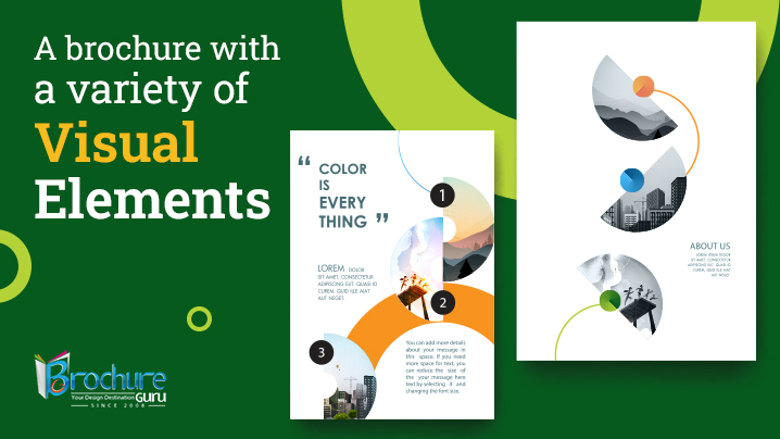
Different elements of visuals incorporated in a brochure
In a brochure, visual identity refers to all of the graphics and images that reflect a brand’s personality and set it out from the competition. If you have a graphic identity, your brochure will include your brand’s visual language. Below, let’s examine these several components that combine to create a brochure’s distinctive visual character.
Graphics – In the context of a visual identity, drawn or created image assets are referred to as graphics. Consider a Lego block or a bottle of any fizzy beverage and how their individual silhouettes represent their respective businesses. They may be as simple as shapes and forms. Perhaps they might be more intricate, like a logo, symbols, or even detailed drawings or animations.
Typography – Typography refers to the layout or design of the text you employ for branding. There are several font varieties, and each one has a distinctive impact on the spectator, including varying degrees of readability. You should think about using your logo’s wordmark as well as a headline typeface and body content font for the brochure’s visual identity. These should all be quite legible.
Color palette – With the employment of a palette of highly particular colors, tones, and tints, color is utilized to identify a brand. It is advised not to use more than three colors at once while making a brochure. When employed well, colors can elicit some of the viewer’s strongest emotional reactions. Despite the fact that the logo is frequently where the color scheme starts, all brand materials should use these colors. In a brochure, the primary color designates your brand’s dominant hue, the secondary color serves as the backdrop, and the accent color provides contrast on certain elements, such as CTA buttons. Remember that the absence of color, like black and white, is also a perfectly acceptable alternative for color.
Imagery – Photography, video material, and any spokespeople that serve as the “image” of the brand in motion are all examples of imagery. When it comes to a brand’s creative vision, designers must choose just those photos that best capture the essence of the company and, most crucially, its target audience. People sympathize with faces and therefore prefer to see themselves mirrored in the companies they use, making this the feature most relevant to the target demographic. This entails, for instance, establishing rules for whether any stock photos or films utilized should appear as corporate or display regular individuals, depending on the audience for whom your graphics are intended.
Logo – Generating visual identity in a brochure begins with the logo. The primary emblem of a company is its logo, which also influences many future decisions about the visual identity’s visuals, colors, and typography. This section would also include branding-focused items like brochure covers and cover photos when the main goal is to establish the brand.
It is indeed up to the visual components to differentiate your brand while going above and beyond to wow, amuse, and influence people. You may take visual components and shape them into a consistent visual identity for your brochure with good graphic design. As a result, an effective brochure design will serve as a guide for maintaining your brand’s goal while also being visually appealing.
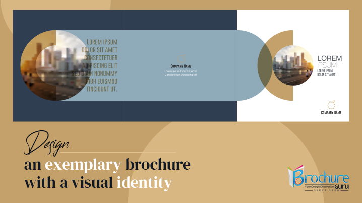
How to design an exemplary brochure with visual identity?
You need to concentrate on additional crucial factors in addition to the aesthetic ones while attempting to create an engaging brochure. Having said that, there is no doubting the fact that adding visual elements to your brochure will elevate it and help it capture customers’ full attention. Whether you choose an e-brochure or a regular one, both can be effectively enhanced with graphic features to stand out from the crowd. Keep in mind that attracting more attention, communicating the message, and accomplishing the goal are your main objectives. This is now achievable because of the efficient implementation of visual components.
The following are the key points to note when designing an outstanding brochure with a strong visual identity:
-Establish your brand identity – The brochure’s aesthetics should follow your brand identity rather than the other way around. After all, the purpose of your graphics is to reflect who you are; therefore, it makes sense to establish this before anything else. Decide on the fundamentals of your brand strategy: What is your core mission? You do not need to have every component of your brand mapped out. How does your business assist people? Who are the buyer personas you use? What kind of communicator are you? Such inquiries enable you to visualize your brand as a persona. While creating your visual identity, personifying your brand will make it much simpler to identify which visual components belong in the brochure and which do not.
-Learn about the components of design – You must first be aware of the language that images use in order to create a visual identity for your brochure that appeals to readers. Here is when graphic design starts to matter. Each of the fundamental components of design will have connections that clients will automatically form based on how you want to use them, and only a limited handful will be suitable for your specific brand. For instance, certain brand typefaces may read as dated while others may seem contemporary. Color meanings might portray a variety of emotions, from passion to calmness. While envisioning the brochure, the elements must be your strongest tool. If you understand how to use it, it will undoubtedly make your goals simpler.
-Narrate a compelling story – While using graphic design in a brochure is helpful for conveying ideas visually, those concepts must be combined to create a compelling narrative about your business. Stories have the capacity to engross people more than images do in grabbing attention. Characters and conflict are at the heart of good storytelling. Choose your hero and give them the challenge to overcome: either your consumers and their problems, or your company and the cacophony of other companies that are not paying attention to their customers’ demands. Above all, the visual style of your brochure must follow the golden rule of storytelling: show, do not tell.
-Focus on simplicity – Obviously, you are using the visual identity of your brochure to offer a large variety of messages, concepts, and stories. It is best to concentrate on one idea at a time to prevent confusion. Within a few seconds, consumers will process visual information, and unless they are actively looking for your brand, they will move past the brochure just as quickly. It is crucial to zero in on the brochure’s top takeaway and center the images around it because you only have a short amount of time to create an impact. You can pick a soothing hue, place a powerful image in the center, or even include a little, engaging video in your e-brochure to make a statement.
-Balance contrast with consistency – Your brochure’s visual identity will unavoidably have a lot of moving pieces. Making sure that every visual component, regardless of its unique function or medium, seems to be part of the same brand is the difficulty. At this point, excellent brochure design and brand style standards are essential. Redundancy is another issue with visual consistency; a brand that is overly predictable risks going unnoticed. Maintaining contrast is a fundamental tenet of employing visual components in brochure design. Seek out possibilities to provide a fresh and diverse contrast to your visual identity. Your brochure may start with a captivating logo and then use the logo’s existing forms, colors, and text to create whole new images.
-Know how to balance the visual elements – You would think that a brochure’s visual identity serves the function of ensuring constant visibility. After all, if nobody is looking, it is difficult to convey visually. The finest visual identity, though, might occasionally be one that goes unnoticed. You can ensure that your message is being received even with minimum use of visual communication because it frequently operates on an unconscious level in a digital brochure. Simply use a colorful background that complements your brand’s look. On the other hand, if you are trying to distinguish your product from other goods on the same shelf, it might make sense to make the brochure’s visual identity stand out. Basically, all you have to do is learn how to keep the visual elements balanced.
-Consider the elements differently for e-brochure and traditional brochure – The graphic components for the brochure must be carefully chosen since they will differ between an e-brochure and a regular brochure. Selecting the proper components can help you gain the customers’ trust. Even slightly different mediums can significantly alter how your visual elements are perceived. For example, colors that look brilliant when seen digitally will appear darker when printed. Similar to how serifs are thought to be the typeface style that is most readable in print or for traditional brochures, sans serif is more readable on a computer screen and is appropriate for e-brochures. Make sure you are appropriately prepared for the adventure of having a compelling brochure wherever your visual aesthetic takes you.
Bottom line
Using a brochure to promote your business is essential. Its design may now incorporate several graphic elements and go beyond simply a few texts. The most important thing is to figure out how to make the pieces representative, explicative, and clear so that customers are attracted right away and comprehend what you are trying to say. A brand’s visual identity is a potent tool for interacting with consumers and expressing its narrative. Avoid using too many aspects since the viewers can become confused if you do. You can always ask for assistance from a brochure design firm for the proper deployment.
Keep in mind that the brochure includes many components to make it ideal; it is not just a piece of paper with photographs. Understanding your own brand identity will ultimately help you on your visual journey, but working with a great brochure design company is the best way to ensure you get a visual identity that fits your brochure. The experts there will incorporate precisely the right elements to make your brochure stand out and eventually take your advertising to the next level.