

 Email:


Designing a logo sounds like an easy task. But in reality, there is a lot more than you can do with the designing process to make it worth the money you are getting from your clients. There are millions out there who are designing unattractive logos for crowdsourcing sites. The real question is how can you be different from the rest? Check out the tips below:
TIP 1: USING DOUBLE ENTENDRE
Some of the catchy logos that are used by many firms globally use double entendre. This is a clever way in which you can wrap two pictures into one showing a clever concept. For instance, if you take a look at the logo of WinePlace, it looks like the shape of a thumbtack. This thumbtack suggests “place”, but the logo also suggests a wine glass placed upside down. The designers who use this technique often are admired for their clever concept. Furthermore, viewers too love such logo and appreciate more.

TIP 2: FOCUS ON COLOR
This is one such thing that you should not avoid. Pay attention to the color palette because each color has meaning and communicate ideas. There are many times the designers have to stick to the brand’s color, but other times they actually get the liberty to explore. Always pick those hues that will grab viewer’s attention. Colors give life to the illustration, thus, it plays a crucial role in the entire designing process. People remember the brand with the color they use like, blue is for Facebook, white is for Apple, green is for Starbucks and more.

TIP 3: STOP OVERUSING THE SAME IDEA
New trends are introduced every year. It is essential for a designer to keep up with the current trends, but at the same time, it is expected from an artist to stop using the same idea again and again. So, as a logo artist, you should know what should you do and where to stop. It is perfectly fine if you study smart trends, but you should not follow them to the letter. In the long run, make sure that you stick to the basics and avoid cliches.
TIP 4: MAKE YOUR LOGO RECOGNIZABLE
For a budding artist, this is a valuable suggestion. Rather than following the crowd, you should come up with an idea that will make your design stand out. For example, if you check the Evernote logo, you can just see an elephant head. The way the trunk is curled and the ear folds, the brand becomes easily recognizable. While you are designing a logo, ask yourself whether it looks generic or catchy. Your first idea will always be generic. Take a notebook and start scribbling with rough sketches before you create the final one.
Design is the silent ambassador of your brand – Paul Rand
TIP 5: CUSTOM TYPE IS ALWAYS ENJOYED BY ALL
Many a time, you can see design as basic and lucid, making the brand name look the best. If your client is paying you well, he or she expects that you will put great efforts to create a unique logo. Custom type ensures that your logo will stay unique. The reality is if your design gets famous, there are many designers who will try to steal it. For the last few years, the stunning Coca-Cola design has been plagiarized many times.
Tip 6: STICK TO SIMPLE THINGS
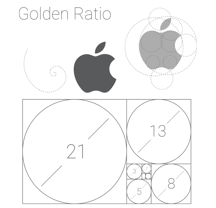
The truth is it is not everyone’s cup of tea to create an attractive and beautiful illustration. Just because you are an artist, it does not mean you can play the role of a typographer or illustrator. Whatever the situation is, always keep in mind that you have to stick to the basics. Logos that are simple yet powerful are the best ones. Consider the logo of the brand Apple. What does it show? Just an apple silhouette. But the missing bite is what makes the design to another level, giving it a character and establishing a deeper meaning. Push yourself so that you can make any boring logo iconic.
TIP 7: KEEP SYMMETRY AND PROPORTION IN MIND
Let us take a look at Twitter’s logo. The circle shows proper arcs and curves, creating a well-balanced logo. However, in Apple’s logo, the missing bite can violate the uniformity of the design, but if you look closely, you can see that there is a lot of symmetry present.
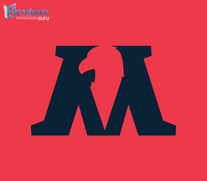
TIP 8: CONSIDER NEGATIVE SPACE
It is quite a smart move if you can utilise the negative space in a logo. The standard example of such is the logo of FedEx with its secret arrow. This is how negative space is used subtly. Many of us see the FedEx logo every day, but fail to notice the arrow.
TIP 9: PASSIVE vs. ACTIVE
This is another interesting feature of logo designing where motion or activity is incorporated in the logo. Though it may not appear appropriate, it gives a visual boost. Let us again look at the Twitter logo. In the early days, the bird changed its position from sitting perched to flying. In the current design, you can see the bird is pointed towards the upward direction.
TIP 10: UNDERSTAND THE MEANING OF THE LOGO
Every logo has a story. Besides a simple sketch, logos have strong and hidden meanings. This we have already explained with some of the aforementioned examples like, the hidden arrow of FedEx’s logo, the missing “byte” in the logo of Apple, the upward flying of Twitter bird and others. It seems great that as a designer you can actually explain it to the clients the thoughts and the logic behind the creation of a logo. Clients may expect something new from you, but you can offer them a logo design that represents the company’s missions and values.
To design is to communicate clearly, by whatever means you can control or master – Milton Glaser
Do your designs lack power?
Now that you have come to know the tips that you have to consider to make your logo appear cool and vogue, start designing from scratch. If you want to outsource your work and create an impactful logo, take a look at the brochure guru site and avail the services offered by the professionals.